
Website Redesign for My Money Mantra
Lorem ipsum dolor sit amet, consectetur adipiscing elit ectus mattis nunc aliquam tincidunt est non viverra nec eu, in ridiculus egestas vulputate tristique.

The Solution
Optimizing Information Architecture and Navigation
The primary navigation of the interface was optimized to reduce cognitive load and facilitate easier discovery of products and sections for users.
The UI design incorporated ample breathing space within a dark theme to create a modern and engaging appearance. Additionally, the focus was on simplifying development by utilizing components and grids.
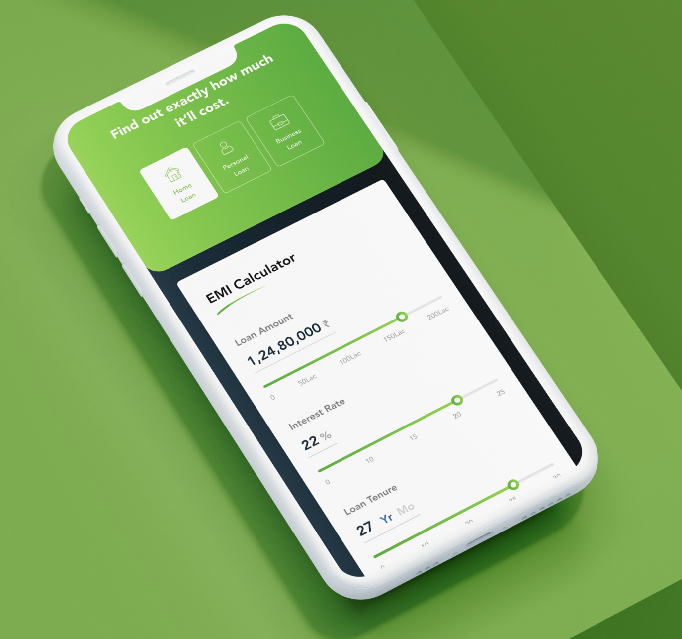
Building Trust and Transparency through Financial Assistance Tools
To cater to our primary audience of young adults, we provided tools such as EMI calculators and credit score graphs. These tools aimed to simplify users' financial journeys, educate them, and build trust in our services.
Customised Journeys
We eliminated lengthy timelines and multiple clicks, creating a simple, minimal-step buying journey to reduce user frustration and boost business revenue. Our goal was to make it extremely easy for users to purchase the products they need.


Short Forms and Long Forms
We introduced both long and short forms with assistive features, a progress timeline, and transparent information to make the documentation and paperwork process seamless and user-friendly.

Bringing the world of NBFCs, to the digital space
MyMoneyMantra has a massive catalogue of financial instruments, for users to leverage. To take these, and put all the information, and paperwork related to them in a digital setting, while not compromising on trust or assuring was the primary focus.
Impact:
- 2.7x increase in digital applications
- 65% reduction in time spent to fill a form
- 42% reduction in bounce rate