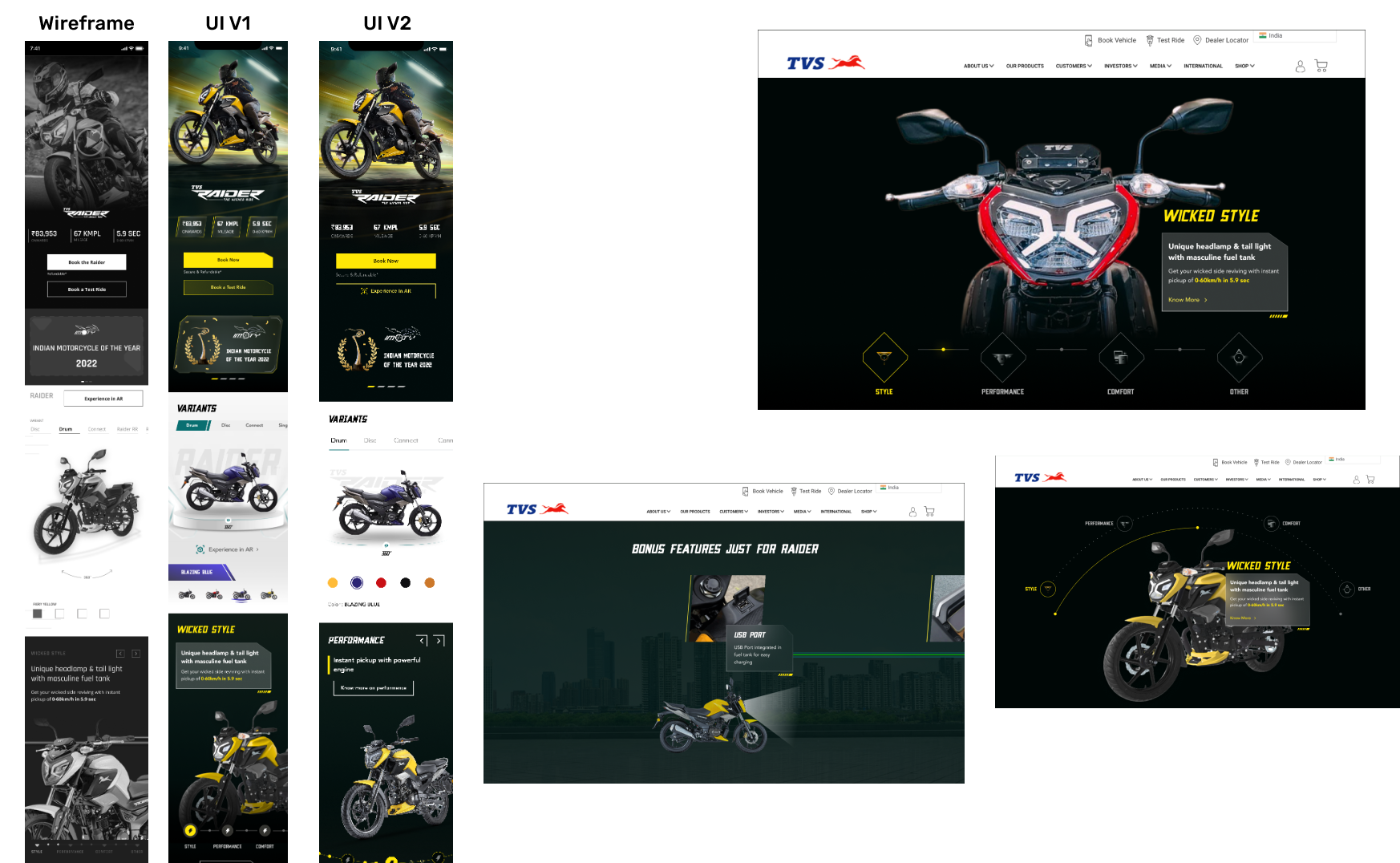
Website design for TVS Raider
Transforming brand image and improving user retention for a sporty, young bike

The Solution
A modern, fresh, sporty and narrative based feature set
We highlighted already existing features present in the existing design such as a video show reel in the top fold, a 360 degree pan of the motorbike.We also added more interesting features such as the feature carousel, the social media and FAQ sections, merchandise and blogs.These features combined create a seamless narrative and story about the bike which is for the users.
Consistency between design elements like buttons, text styles, interactions etc.
The older design lacked consistency between the following :Web and ResponsiveInterctions across various platformsColours, fonts, elements of designWe ensured through the design to make sure the entire design and commuication language of the webpage was seamless.
Clear, no nonsense, actionable CTA’s
In the older design, the navigational bar was icon driven and stuck to the left hand side. During our user interviews, we found out that users were unable to understand this navigational component and were unable to know what actions they had available to perform.We ensured there were clear primary, secondary and tertiary action buttons available across the interface.


A seamless consistency between the mobile responsive and web design
Starting with Mobile first; and then translating the design for Web and Tablet was the way forward. This way we could create for limited space and then scale up the design.We had to keep in mind all platforms and devices that our users use to ensure we created something that works efficiently for everyone.